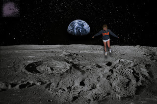
I chose to place myself hovering over the moon because it is somewhere I've never been and will likely never go. The hardest part of this project was definitely adding the adjustment layers and trying to create a shadow that makes it look like I was floating. In order to do that, I turned down the brightness and added a drop shadow. For the drop shadow, I rotated it 90 degrees in order to make it below my feet then I adjusted the distance, size, and spread. The easiest part was probably masking myself out of the original picture. I used the quick selection tool and then a layer mask to cut myself out.


Hey Sinclaire, I love your logo, and I think it looks really great on your first card with the color choices you made. The wavy design is awesome, and it looks really clean and professional. Great job!
ReplyDeleteHey Sinclaire, I really like your business cards and your logo. I think the colors that you chose were very pretty with the logo. It looks very professional, I really liked it.
ReplyDelete