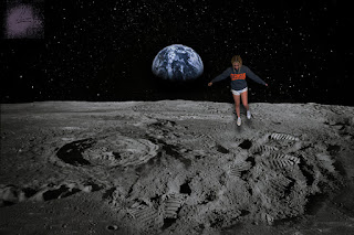
Posts

Portfolio

Image
  This is my final portfolio with all of my projects throughout the semester. FMX-210 pushed me to work hard and to step outside of my comfort zone creatively. The hardest project to do was definitely the canvas because I was working with a program I had never used before as well as coding which is also something I was unfamiliar with. My favorite project to do was the somewhere project. Overall, I'm happy with how my projects and my portfolio turned out.

Business Cards

Image
      For my business cards, I chose each color scheme because I wanted it to match with the logos. I also wanted to make the cards relatively minimalistic in order to not draw attention away from the logo itself. The most difficult part of this project was definitely coming up with the designs and then trying to create them on InDesign. I think the easiest part was the set up and choosing which font to use as well as the placement of the text. 

Autoscopy

Image
  For my autoscopy, I did my face in front of a thunderstorm with flowers in the sky. I made space spill from my face as well. I used thunder and violets because they've been incorporated in almost all of the rest of my projects and I wanted to include them. The hardest part of this project was trying to mask everything out. The easiest part was adding layers and effects to make everything look more cohesive.

Somewhere

Image
     I chose to place myself hovering over the moon because it is somewhere I've never been and will likely never go. The hardest part of this project was definitely adding the adjustment layers and trying to create a shadow that makes it look like I was floating. In order to do that, I turned down the brightness and added a drop shadow. For the drop shadow, I rotated it 90 degrees in order to make it below my feet then I adjusted the distance, size, and spread. The easiest part was probably masking myself out of the original picture. I used the quick selection tool and then a layer mask to cut myself out. 

BW to color

Image
    To start this project, I first picked a color scheme. I used the main color of purple and then used an analogous, monochromatic, and triad schemes. The most tedious part of this project was making the selections. It was the most time consuming part of the entire assignment and I had trouble getting all the small details selected. The easiest part of this project was creating the masks and coloring the selections in. My favorite re-coloring is the analogous color scheme because I think the colors go really well together.     

Tag Brush

Image
    This is the final version of my tag brush. In order to create it, I used my black and white logo and turned it into a brush. The most difficult part of this process was deciding which splatter to use and trying to make the scratches and negative perfect. Once I was happy with how it looked I turned it into a brush by exporting it. Now I can use it on the rest of my projects.  

Propaganda poster

Image
       To make this poster I started with the self portrait. I began by outlining the features on my face then adding detail like eyelashes and shadows afterwards. Next I created the hand holding the can and the bottle "factories" in the background. The final part was the words. The words were by far the easiest part of this project. I think the most difficult part was either the self portrait or creating the bottles. The bottle shape was really frustrating and I could never get it right.      I chose to do my propaganda poster on recycling because it's something so easy and simple yet can be so effective. The tools I used for this project were mostly the pen tool. It was frustrating to use it for things like my eyelashes and the highlights in the hair but for everything else the pen tool was really easy to use.